1.ΡΘΑεΡΎ»ί
’β «“Μ’≈÷Λ»·ΙΪΥΨΡξΕ»ΦΤΜ°Άξ≥…«ιΩωΦύΩΊΩ¥ΑεΘ§Ζ÷±π¥” ’≈ΧΦέΓΔ≥…ΫΜΝΩΓΔΉή –÷ΒΒ»ΦΗΗωΈ§Ε»Ϋχ––…ν»κΖ÷ΈωΓΘ
ΡΘΑε Βœ÷–ßΙϊ»γœ¬ΘΚ
ΡΘΑεœ¬‘ΊΘΚΒψΜςΝ¥Ϋ”ΙΪΥΨΡξΕ»ΦΤΜ°±μ
ΡΘΑεΧΊ…ΪΙΠΡήΘΚTAB¬÷≤Ξ
2.ΡΘΑεΙΙ≥…
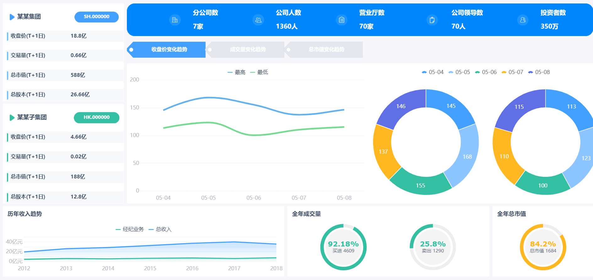
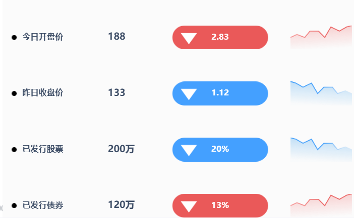
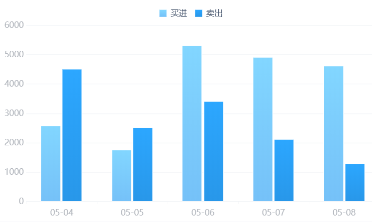
’β «“Μ’≈Ψω≤Ώ±®±μΡΘΑεΘ§ ”Ο”ΎPCΕΥ’Ι ΨΘ§ΡΘΑε“ΜΙ≤”…14ΗωΉιΦΰΙΙ≥…ΓΘ
| –ρΚ≈ |
ΉιΦΰάύ–Ά |
Ηω ΐ |
…φΦΑΙΠΡή |
–ßΙϊ’Ι Ψ |
| 1 |
÷Η±ξΩ® |
4 |
/ |

|
| 2 |
ΆΦ±μ |
5 |
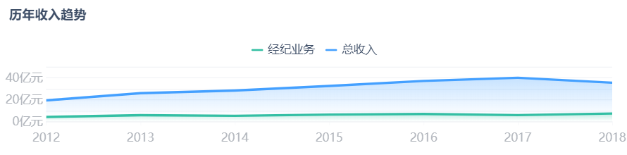
ΟφΜΐΆΦΓΔ’έœΏΆΦΓΔ±ΐΆΦΓΔ÷υ–ΈΆΦΓΔΧθ–ΈΆΦ |
|
| 3 |
“«±μ≈Χ |
4 |
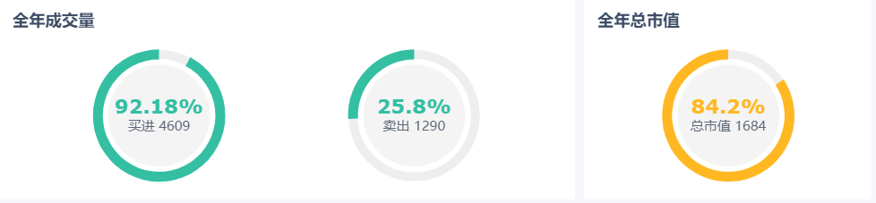
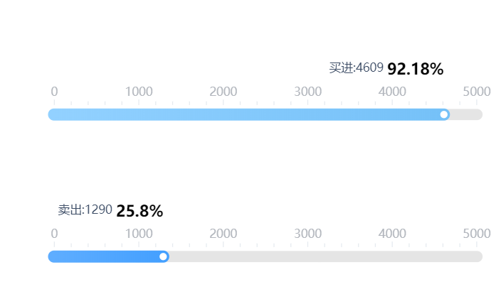
‘Ιή–Ά“«±μ≈ΧΓΔΑΌΖ÷±»‘≤ΜΖ–Έ“«±μ≈Χ |
|
| 4 |
TAB |
1 |
/ |
 |
3.≤ΦΨ÷”κ τ–‘…η÷Ο
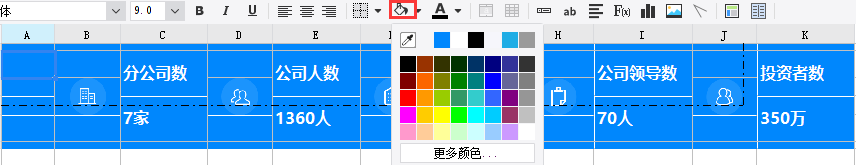
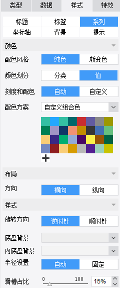
―Γ÷–body→[ τ–‘]→≤ΦΨ÷ΖΫ Ϋ≤…”ΟΉ‘ ”Π≤ΦΨ÷Θ§ΉιΦΰΥθΖ≈¬ΏΦ≠―Γ‘ώΥΪœρΉ‘ ”ΠΘ§ΉιΦΰΦδΦδΗτ…ηΕ®ΈΣ5Θ§’ϊΧε±≥ΨΑ―’…Ϊ―Γ‘ώΝΥ“ΜΗωΦΪΒ≠ΒΡΜ“…ΪΘ®―’…ΪΒΡrgb―’…Ϊ÷ΒΈΣ247,248,250Θ§ °ΝυΫχ÷Τ―’…Ϊ¬κΈΣ#F7F8FAΘ©Θ§bodyΡΎ±ΏΨύ»Ϊ≤Ω…ηΕ®ΈΣ10
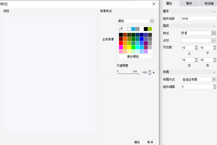
ΤδΥϋΉιΦΰΒΡ±≥ΨΑ―’…ΪΨυΒς≥…ΑΉ…ΪΘ§ΉιΦΰ¥σ–ΓΒς’ϊΦϊΒΎ4≤ΩΖ÷——ΉιΦΰ Βœ÷Υυ ωΓΘ
4.ΉιΦΰ Βœ÷
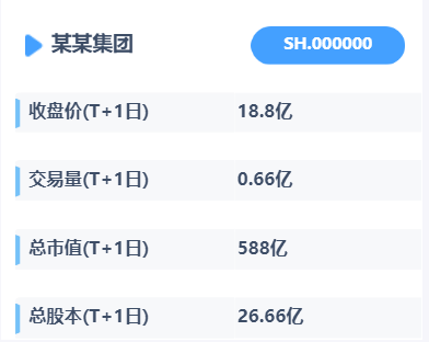
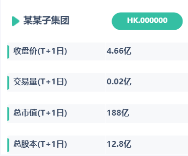
1Θ©÷Η±ξΩ®
ΔΌ–¬Ϋ®“ΜΗωΤ’Ά®±®±μΩιΘ§œρbodyάοΟφΆœ»κ±®±μΩι’ΐ≥Θ±ύΦ≠ΡΎ»ίΦ¥Ω…

ΔΎ±ύΦ≠±®±μΩιΘΚΆ®ΙΐΫΪ±≥ΨΑ»Ψ…ΪΓΔΚœ≤ΔΒΞ‘ΣΗώΓΔΒς’ϊ¥σ–ΓΒ»±δ≥…Κœ ΒΡ―υ Ϋ
ΔέΫΪΧα«ΑΉΦ±ΗΚΟΒΡ–ΓΆΦ±ξΆ®ΙΐΓΨ≤ε»κΆΦΤ§ΓΩΒΡΖΫ Ϋ≤ε»κΒΫœύ”ΠΒΡΒΞ‘ΣΗώΘ§ΫΪœύΙΊ÷Η±ξΒΡΈΡ±Ψ≤ε»κΒΫΕ‘”ΠΒΡΒΞ‘ΣΗώΓΘ
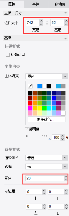
Δή…η÷Ο¥ΥΉιΦΰ¥σ–Γ”κΒΡ‘≤Ϋ«±ΏΩρΘ§ΡΎ»ίœ‘ ΨΖΫ ΫΘΚΥΪœρΤΧ¬ζ±®±μΩι
Δί‘Λάά–ßΙϊ
άύΥΤΩ…Ήω≥ω»γœ¬Υυ Ψ÷Η±ξΩ®ΘΚ
ΆΊ’ΙΘΚ
÷Η±ξΩ®ΒΡ―υ ΫΚήΕύ―υΘ§±Ψ’≈ΡΘΑε≤…”ΟΒΡΫτΫτ «÷Η±ξΩ®ΉνΜυ±ΨΒΡ―υ ΫΘ§ΤδΥϊΗϋΕύ’Ι Ψ–Έ ΫΩ…ΦϊΘΚhttps://market.fanruan.com/reuse
ΓΨ¥σΤΝΥΊ≤ΡΦρΫιΓΩhttps://help.fanruan.com/dvg/doc-view-68.html
ΓΨΆΦ±ξΥΊ≤Ρœ¬‘ΊΆχ’ΨΓΩhttps://www.ztupic.com/tupian/15850529689525/0-15-1-0-1.html
https://www.iconfont.cn/
Θ®“‘…œΝΫΗωΆΦ±ξΥΊ≤Ρœ¬‘ΊΆχ’ΨΨυά¥Ή‘”ΎΆβ≤ΩΖ«ΖΪ»μΥυ”–Θ§…Χ”Ο«κΉΔ“βΑφ»®Έ ΧβΘ©
2)TabΩι
ΔΌ―Γ‘ώΩ’ΑΉΩι÷–ΒΡtabΩιΆœ»κΒΫbody÷–ΓΨTabΩι-https://help.fanruan.com/finereport/doc-view-633.html#ΓΩ

ΔΎΒψΜς”“…œΫ«“ΘΪ”–¬‘ω±ξ«©

Δέ―Γ÷–Ρ≥Ηω±ξ«©“≥–όΗΡ±ξΧβ

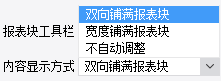
Δή―Γ÷–»ίΡ…tab“≥±ξ«©ΒΡΟφΑεtabpane,Ω…“‘–όΗΡ―υ ΫΡΘΑε
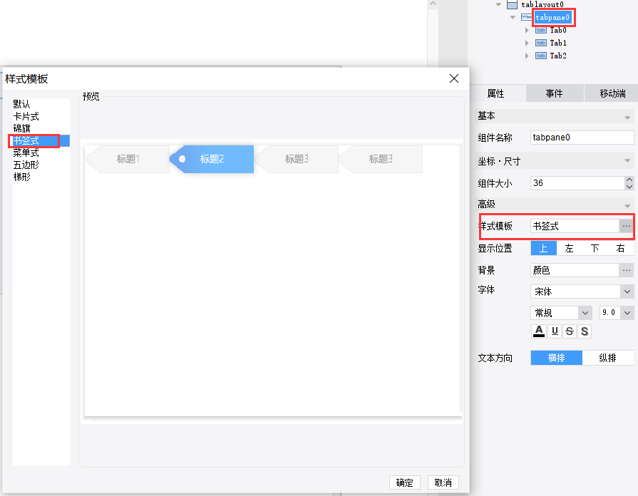
Δί…η÷ΟTabΩιΒΡ’ϊΧε≤ΦΨ÷“‘ΦΑ¬÷≤ΞΦδΗτ
ΆΊ’ΙΘΚ
ΗϋΕύTabΩι¬÷≤Ξ Βœ÷ΖΫ Ϋ»γœ¬ΘΚ
Ψω≤Ώ±®±μTabΩι¬÷≤ΞΧΊ–ß≤εΦΰ-https://help.fanruan.com/finereport/doc-view-3247.html
JS Βœ÷ΒψΜς≥§Ν¥«–ΜΜTabΩι-https://help.fanruan.com/finereport/doc-view-2099.html
JS Βœ÷Ψω≤Ώ±®±μ÷–TabΩι¬÷≤Ξ-https://help.fanruan.com/finereport/doc-view-2005.html
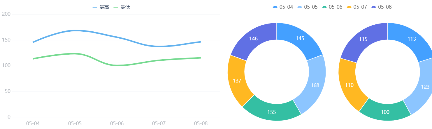
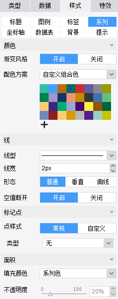
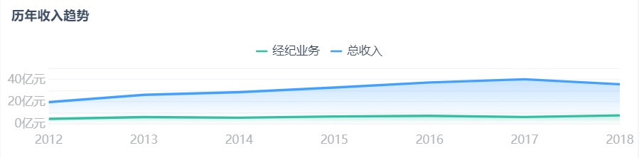
3Θ©’έœΏΆΦ
ΔΌ≤ε»κ’έœΏΆΦΘΚ―Γ÷–ΒΎ“ΜΗω±ξ«©Θ§ΫΪΆΦ±μάΗάοΒΡ’έœΏΆΦΆΦ±ξΆœΉßΒΫ…œ“Μ≤Ϋ–¬Ϋ®ΚΟTabΩιΘ§±ύΦ≠’έœΏΆΦΘ§≤Έ’’ΓΨ’έœΏΆΦ-https://help.fanruan.com/finereport/doc-view-1505.htmlΓΩ

ΔΎ±ύΦ≠’έœΏΆΦΘΚ’έœΏΆΦάύ–Ά―Γ‘ώΈΣΒΎ“Μ÷÷
Δέ―Γ‘ώΕ‘”ΠΒΡ ΐΨίΦ·Θ§Τδ÷–œΒΝ–Οϊ―Γ‘ώΉ÷ΕΈ÷Β
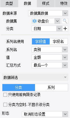
Δή‘Ύ―υ Ϋ÷–Ω…“‘…η÷ΟΆΦ±μΒΡΆΦάΐΚΆ‘ΎœΒΝ–÷–Ϋχ––≈δ…ΪΚΆΒςœΏΩμΒ»
ΔίΒς’ϊΉιΦΰ¥σ–Γ
Δό‘Λάά–ßΙϊ
ΆΊ’ΙΘΚ
ΤδΥϊΗϋΕύ’έœΏΆΦ’Ιœ÷–Έ ΫΩ…ΦϊΘΚhttps://market.fanruan.com/reuse
ΗϋΕύ’έœΏΆΦ’Ιœ÷ΦΦ«…»γœ¬ΘΚ
’έœΏΆΦΉν÷Β…η÷Ο…ΝΥΗΕ·Μ≠-https://help.fanruan.com/finereport/doc-view-1721.html
’έœΏΆΦΗΡ±δœΏΧθΜρ±ξΦ«Βψ τ–‘-https://help.fanruan.com/finereport/doc-view-3535.html
ΗϋΕύ’έœΏΆΦ Βœ÷ΖΫΖ®»γœ¬ΘΚ
¥σ ΐΨί’έœΏΆΦ-https://help.fanruan.com/finereport/doc-view-1955.html
ΫΞ±δ’έœΏΆΦ-https://help.fanruan.com/finereport/doc-view-3218.html
Ε·Χ§¬÷≤Ξ’έœΏΆΦ-https://help.fanruan.com/finereport/doc-view-3259.html
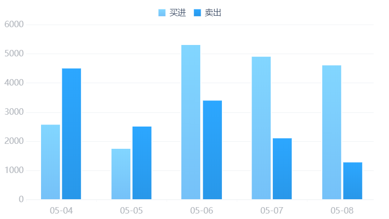
4Θ©±ΐΆΦ
ΔΌ≤ε»κ±ΐΆΦΘΚ―Γ÷–ΒΎ“ΜΗω±ξ«©Θ§ΫΪΆΦ±μάΗάοΒΡ±ΐΆΦΆΦ±ξΆœΉßΒΫ2)÷––¬Ϋ®ΚΟTabΩιΘ§±ύΦ≠±ΐΆΦΘ§≤Έ’’ΓΨ±ΐΆΦ-https://help.fanruan.com/finereport/doc-view-776.htmlΓΩ

ΔΎάύ–Ά―Γ‘ώΒΎ“Μ÷÷

Δέ―Γ‘ώΕ‘”ΠΒΡ ΐΨίΦ·Θ§Ή÷ΕΈΟϊ Ι”ΟœΒΝ–Οϊ
Δή…η÷ΟΆΦάΐΓΔ±ξ«©ΓΔ≈δ…ΪΒ»
ΔίΒς’ϊΉιΦΰ¥σ–Γ
Δό‘Λάά–ßΙϊ
ΆΊ’ΙΘΚ
ΤδΥϊΗϋΕύ±ΐΆΦ’Ιœ÷–Έ ΫΩ…ΦϊΘΚhttps://market.fanruan.com/reuse
ΗϋΕύ±ΐΆΦ Βœ÷ΖΫΖ®»γœ¬ΘΚ
Ακ‘≤±ΐΆΦ-https://help.fanruan.com/finereport/doc-view-1307.html
ΜΖ–Έ±ΐΆΦ-https://help.fanruan.com/finereport/doc-view-1308.html
ΕύΖ÷άύ±ΐΆΦ-https://help.fanruan.com/finereport/doc-view-1310.html
¬÷≤ΞΜΖ–ΈΆΦΘΚhttps://help.fanruan.com/finereport/doc-view-3324.html
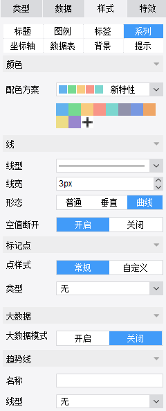
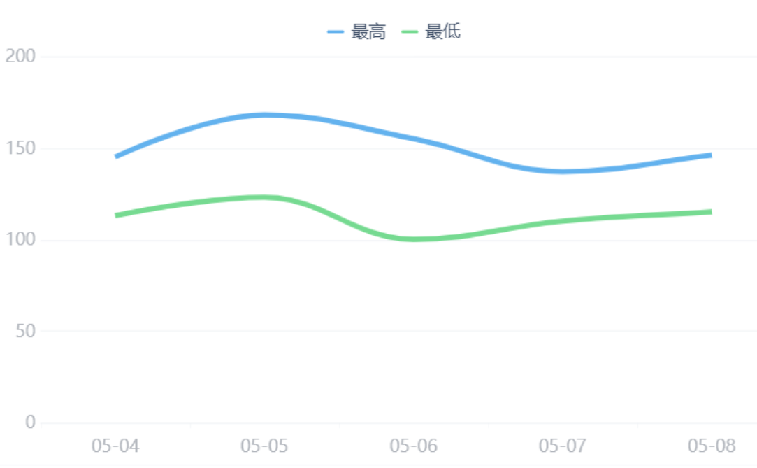
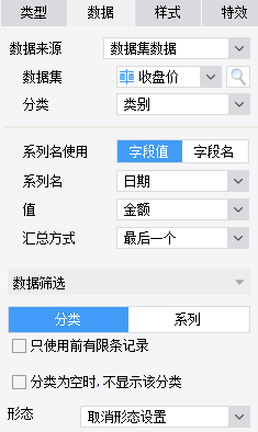
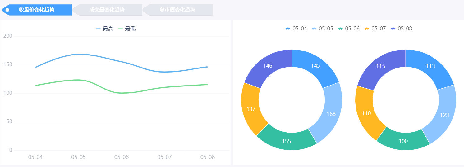
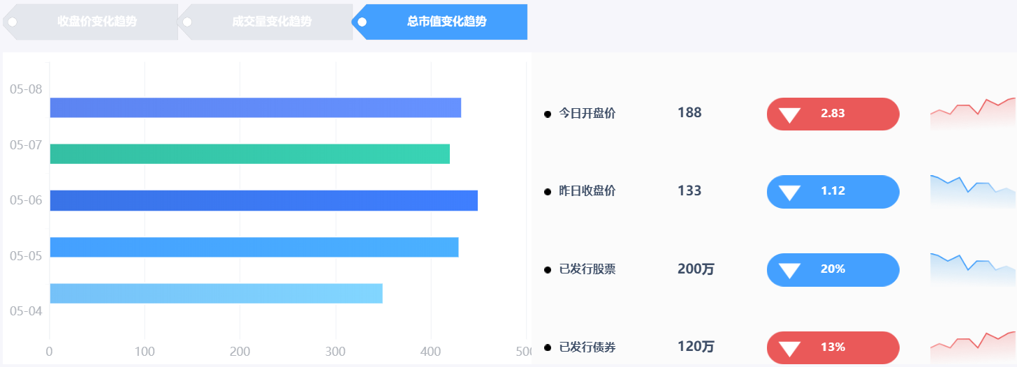
÷Ν¥ΥTabΩι÷–ΒΎ“ΜΗω±ξ«©“≥ΒΡΆΦ±μ“―Άξ≥…Θ§≤ΦΨ÷≤…”ΟΉσ”“≤ΦΨ÷Θ§’έœΏΆΦ‘ΎΉσΘ§ΜΖ–ΈΆΦ‘Ύ”“ΓΘ≤ΦΨ÷–ßΙϊ»γΆΦΥυ ΨΘΚ
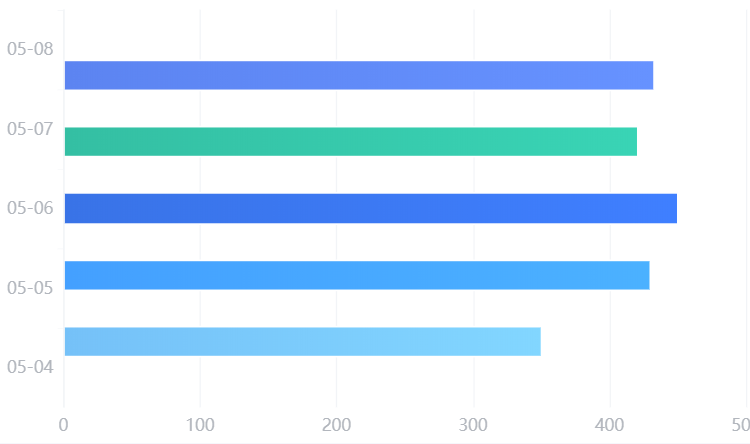
5Θ©÷υ–ΈΆΦ
ΔΌ≤ε»κ÷υ–ΈΆΦΘΚ―Γ÷–ΒΎΕΰΗω±ξ«©Θ§ΫΪΆΦ±μάΗάοΒΡ÷υ–ΈΆΦΆΦ±ξΆœΉßΒΫ2)÷––¬Ϋ®ΚΟTabΩιΘ§±ύΦ≠÷υ–ΈΆΦΘ§≤Έ’’ΓΨ÷υ–ΈΆΦ-https://help.fanruan.com/finereport/doc-view-1400.htmlΓΩ

ΔΎάύ–Ά―Γ‘ώΒΎ“Μ÷÷
Δέ―Γ‘ώΕ‘”ΠΒΡ ΐΨίΦ·Θ§œΒΝ–Οϊ―Γ‘ώΉ÷ΕΈ÷Β
Δή…η÷Ο―υ Ϋ
ΔίΒς’ϊΉιΦΰ¥σ–Γ
Δό‘Λάά–ßΙϊ
ΆΊ’ΙΘΚ
ΤδΥϊΗϋΕύ÷υ–ΈΆΦ’Ιœ÷–Έ ΫΩ…ΦϊΘΚhttps://market.fanruan.com/reuse
ΗϋΕύ÷υ–ΈΆΦ Βœ÷ΖΫΖ®»γœ¬ΘΚ
ΫΞ±δ÷υ–ΈΆΦ-https://help.fanruan.com/finereport/doc-view-3548.html
ΜΓ–Έ÷υ–ΈΆΦ-https://help.fanruan.com/finereport/doc-view-2664.html
Ε―Μΐ÷υ–ΈΆΦ-https://help.fanruan.com/finereport/doc-view-3425.html
ΧΊ βΆΦ–Έ÷υ–ΈΆΦ-https://help.fanruan.com/finereport/doc-view-3776.html
’Φ±»÷υ–ΈΆΦ-https://help.fanruan.com/finereport/doc-view-3563.html
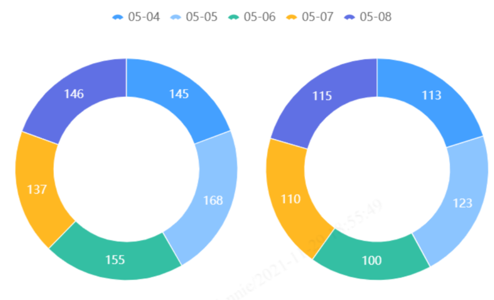
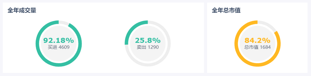
6Θ© ‘Ιή–Ά“«±μ≈Χ
ΔΌ≤ε»κ“«±μ≈ΧΘΚ―Γ÷–ΒΎΕΰΗω±ξ«©Θ§ΫΪΆΦ±μάΗάοΒΡ“«±μ≈ΧΆΦ±ξΆœΉßΒΫ2)÷––¬Ϋ®ΚΟTabΩιΘ§±ύΦ≠“«±μ≈ΧΘ§≤Έ’’ΓΨ ‘Ιή–Ά“«±μ≈Χ-https://help.fanruan.com/finereport/doc-view-1326.htmlΓΩ

ΔΎάύ–Ά―Γ‘ώΉνΚσ“Μ÷÷— ‘Ιή–Ά“«±μ≈Χ
Δέ―Γ‘ώΕ‘”ΠΒΡ ΐΨίΦ·
Δή‘Ύ―υ Ϋ÷–…η÷ΟΆΦ±μΒΡ±ξ«©ΓΔ≈δ…ΪΒ»
ΔίΒς’ϊΉιΦΰ¥σ–Γ

Δό‘Λάά–ßΙϊ
ΆΊ’ΙΘΚ
ΤδΥϊΗϋΕύ“«±μ≈Χ’Ιœ÷–Έ ΫΩ…ΦϊΘΚhttps://market.fanruan.com/reuse
ΗϋΕύ“«±μ≈Χ Βœ÷ΖΫΖ®»γœ¬ΘΚ
Εύ÷Η’κ“«±μ≈Χ-https://help.fanruan.com/finereport/doc-view-1324.html
ΑΌΖ÷±»‘≤ΜΖ“«±μ≈Χ-https://help.fanruan.com/finereport/doc-view-1325.html
ΑΌΖ÷±»ΩΧΕ»≤έ–Ά“«±μ≈Χ-https://help.fanruan.com/finereport/doc-view-3380.html
÷Ν¥ΥTabΩι÷–ΒΎΕΰΗω±ξ«©“≥ΒΡΆΦ±μ“―Άξ≥…Θ§≤ΦΨ÷≤…”ΟΉσ”“≤ΦΨ÷Θ§÷υ–ΈΆΦ‘ΎΉσΘ§ ‘Ιή–Ά“«±μ≈Χ‘Ύ”“ΓΘ≤ΦΨ÷–ßΙϊ»γΆΦΥυ ΨΘΚ
7Θ©Χθ–ΈΆΦ
ΔΌ≤ε»κΧθ–ΈΆΦΘΚ―Γ÷–ΒΎ»ΐΗω±ξ«©Θ§ΫΪΆΦ±μάΗάοΒΡΧθ–ΈΆΦΆΦ±ξΆœΉßΒΫ2)÷––¬Ϋ®ΚΟTabΩιΘ§±ύΦ≠Χθ–ΈΆΦΘ§≤Έ’’ΓΨΧθ–ΈΆΦ-https://help.fanruan.com/finereport/doc-view-3361.htmlΓΩ

ΔΎάύ–Ά―Γ‘ώΒΎ“Μ÷÷
Δέ―Γ‘ώΕ‘”ΠΒΡ ΐΨίΦ·Θ§Τδ÷–œΒΝ–Οϊ―Γ‘ώΉ÷ΕΈ÷Β

Δή‘Ύ―υ Ϋ÷–Βς’ϊΆΦ±μΒΡ≈δ…ΪΓΔΦδΗτΓΔ…η÷ΟΉχ±ξ÷α
ΔίΒς’ϊΉιΦΰ¥σ–Γ
Δό‘Λάά–ßΙϊ
ΆΊ’ΙΘΚ
ΤδΥϊΗϋΕύΧθ–ΈΆΦ’Ιœ÷–Έ ΫΩ…ΦϊΘΚhttps://market.fanruan.com/reuse
ΗϋΕύΧθ–ΈΆΦ’Ιœ÷ΦΦ«…»γœ¬ΘΚ
Χθ–ΈΆΦΗτ––±δ…Ϊ-https://help.fanruan.com/finereport/doc-view-3493.html
¬÷≤ΞΧθ–ΈΆΦ-https://help.fanruan.com/finereport/doc-view-3836.html
Ε·Χ§¬÷≤ΞΧθ–ΈΆΦ-https://help.fanruan.com/finereport/doc-view-3193.html
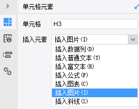
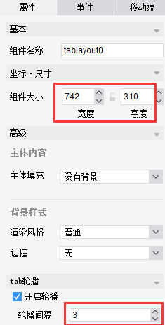
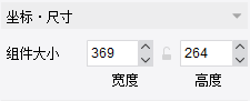
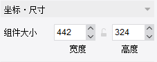
≤ε»κ÷Η±ξΩ®ΘΚ―Γ÷–ΒΎ»ΐΗω±ξ«©Θ§ΫΪΩ’ΑΉΩι÷–ΒΡ±®±μΩιΆœΉßΒΫ2)÷––¬Ϋ®ΚΟTabΩιΘ§»ΜΚσ±ύΦ≠―υ ΫΘ§…η÷Ο¥σ–ΓΈΣ445*324ΓΘ
÷Ν¥ΥΘ§TabΩι÷–ΒΎ»ΐΗω±ξ«©“≥ΒΡΆΦ±μ“―Άξ≥…Θ§≤ΦΨ÷≤…”ΟΉσ”“≤ΦΨ÷Θ§Χθ–ΈΆΦ‘ΎΉσΘ§÷Η±ξΩ®‘Ύ”“ΓΘ≤ΦΨ÷–ßΙϊ»γΆΦΥυ ΨΘΚ
8Θ©ΟφΜΐΆΦ
ΔΌΫΪΆΦ±μάΗ÷–ΒΡΟφΜΐΆΦΆΦ±ξΆœ»κΒΫbody÷–ΓΨΟφΜΐΆΦ-https://help.fanruan.com/finereport/doc-view-3379.htmlΓΩ

ΔΎάύ–Ά―Γ‘ώΈΣΒΎΕΰ÷÷
Δέ―Γ‘ώΕ‘”ΠΒΡ ΐΨίΦ·Θ§Τδ÷–œΒΝ–Οϊ―Γ‘ώΉ÷ΕΈ÷Β

Δή‘Ύ―υ Ϋ÷–Ω…“‘…η÷ΟΆΦ±μ±ξΧβΓΔ≈δ…ΪΒ»
ΔίΒς’ϊΉιΦΰ¥σ–Γ

Δό‘Λάά–ßΙϊ
ΆΊ’ΙΘΚ
ΤδΥϊΗϋΕύΟφΜΐΆΦ’Ιœ÷–Έ ΫΩ…ΦϊΘΚhttps://market.fanruan.com/reuse
ΗϋΕύΟφΜΐΆΦ Βœ÷ΖΫΖ®»γœ¬ΘΚ
ΑΌΖ÷±»Ε―ΜΐΟφΜΐΆΦ-https://help.fanruan.com/finereport/doc-view-1314.html
¥Ι÷±ΚΆ«ζœΏΟφΜΐΆΦ-https://help.fanruan.com/finereport/doc-view-1315.html
ΖΕΈßΟφΜΐΆΦ-https://help.fanruan.com/finereport/doc-view-3773.html
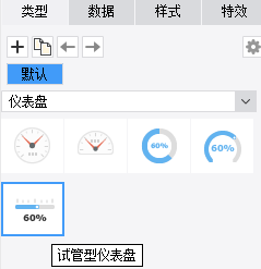
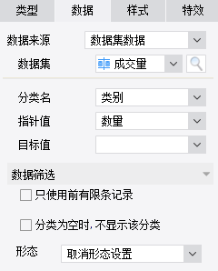
9Θ©ΑΌΖ÷±»ΜΖ–Έ“«±μ≈Χ
ΔΌ≤ε»κ“«±μ≈ΧΘΚ―Γ÷–bodyΘ§ΫΪΆΦ±μάΗάοΒΡ“«±μ≈ΧΆΦ±ξΆœΉßΒΫbody÷–Θ§±ύΦ≠“«±μ≈ΧΘ§≤Έ’’ΓΨΑΌΖ÷±»ΩΧΕ»≤έ–Ά“«±μ≈Χ-https://help.fanruan.com/finereport/doc-view-3380.htmlΓΩ
ΔΎάύ–Ά―Γ‘ώΈΣΒΎ»ΐ÷÷
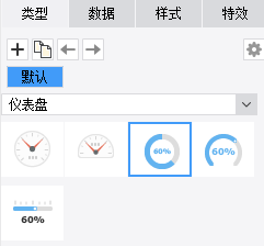
Δέ―Γ‘ώΕ‘”ΠΒΡ ΐΨίΦ·Θ§ΗυΨίΤΞ≈δΒΡ÷Η’κ÷ΒΚΆΡΩ±ξ÷ΒΜαΉ‘Ε·…ζ≥…ΡΩ±ξ¥ο≥…ΑΌΖ÷±»
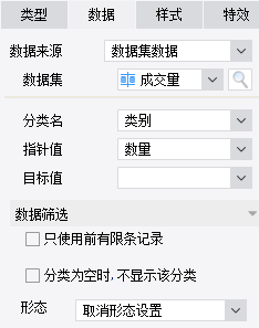
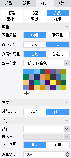
Δή…η÷Ο―υ ΫΘ§Ω…“‘‘ΎœΒΝ–÷–Άξ≥…Ε‘ΗΟΆΦ±μ≈δ…ΪΓΔ≤ΦΨ÷ΓΔΩΧΕ»≤έΓΔ÷Η’κΓΔΑκΨΕ¥σ–ΓΒ»œΗΫΎΒΡΒς’ϊΓΘ
ΔίΒς’ϊΉιΦΰ¥σ–ΓΘ®Ά§άμΩ…“‘Ήω≥ω“»ΪΡξΉή –÷Β”ΒΡ“«±μ≈ΧΘ§ ΐΨίΦ·ΈΣΓΨEmbedded1ΓΩΘ©
Δό‘Λάά–ßΙϊ
ΆΊ’ΙΘΚ
ΤδΥϊΗϋΕύ“«±μ≈Χ’Ιœ÷–Έ ΫΩ…ΦϊΘΚhttps://market.fanruan.com/reuse
ΗϋΕύ“«±μ≈Χ Βœ÷ΖΫΖ®»γœ¬ΘΚ
Εύ÷Η’κ“«±μ≈Χ-https://help.fanruan.com/finereport/doc-view-1324.html
ΑΌΖ÷±»‘≤ΜΖ“«±μ≈Χ-https://help.fanruan.com/finereport/doc-view-1325.html
‘Ιή–Ά“«±μ≈Χ-https://help.fanruan.com/finereport/doc-view-1326.html
| 
